

Greater China Illustration Awards Identity by Toby Ng
Published Jun 21, 2016
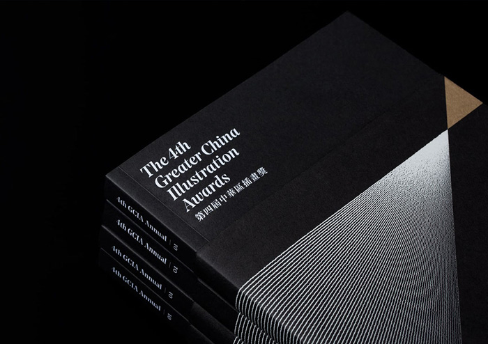
Hong Kong-based creative director Toby Ng created this sophisticated identity and collateral for the 4th Greater China Illustration Awards, organized by the Hong Kong Society of Illustrators.
“Based on their theme ‘A Vibrant Transformation A Meticulous Masterpiece’, we designed their identity and all the printed matter related to the Awards. The design, comprised of a set of 4 graphics, depicts a small colour-coded triangle that radiates into a big triangle through a variety of patterned organic lines. The small triangle represent the illustrator’s hand / pen / brush and the big triangle, with its various organic, hand crafted line patterns symbolises creativity and possibilities.
Four colours and four patterns created a colour code to distinguish the different award categories and sections; these were used in the small triangles to reinforce the competition’s award identity.”


More articles


#want


These are affiliate links to Amazon and other partner brands. We may earn a small commission if you click the link and make a purchase.
There is no extra cost to you, so it’s just a nice way to help support the site.


Related
inspiration
Awesome products for creatives
These are affiliate links to Amazon and other partner brands. We may earn a small commission if you click the link and make a purchase.
There is no extra cost to you, so it’s just a nice way to help support the site.
Inspiration
in your inbox
Amazing art & design, never any spam.
We care about protecting your data. Please refer to our Privacy Policy for more.
- Advertising
- Architecture
- Art
- Branding
- Fashion & Beauty
- Gaming
- Graphic Design
- Illustration
- Industrial Design
- Interior Design
- Logo Design
- Packaging Design
- Photography
- Pop Culture
- Print Design
- Product Design
- Technology
- Typography
- UX & UI Design
- Vehicle Design
- Video & Motion
© 2026 Inspiration Grid, all rights reserved. Some of our posts may contain affiliate links to partner brands. We earn a small commission if you click the link and make a purchase. There is no extra cost to you, so it’s just a nice way to help support the site. All images, videos, and other content posted on the site is attributed to their creators and original sources. If you see something wrong here or you would like to have it removed, please contact us.