

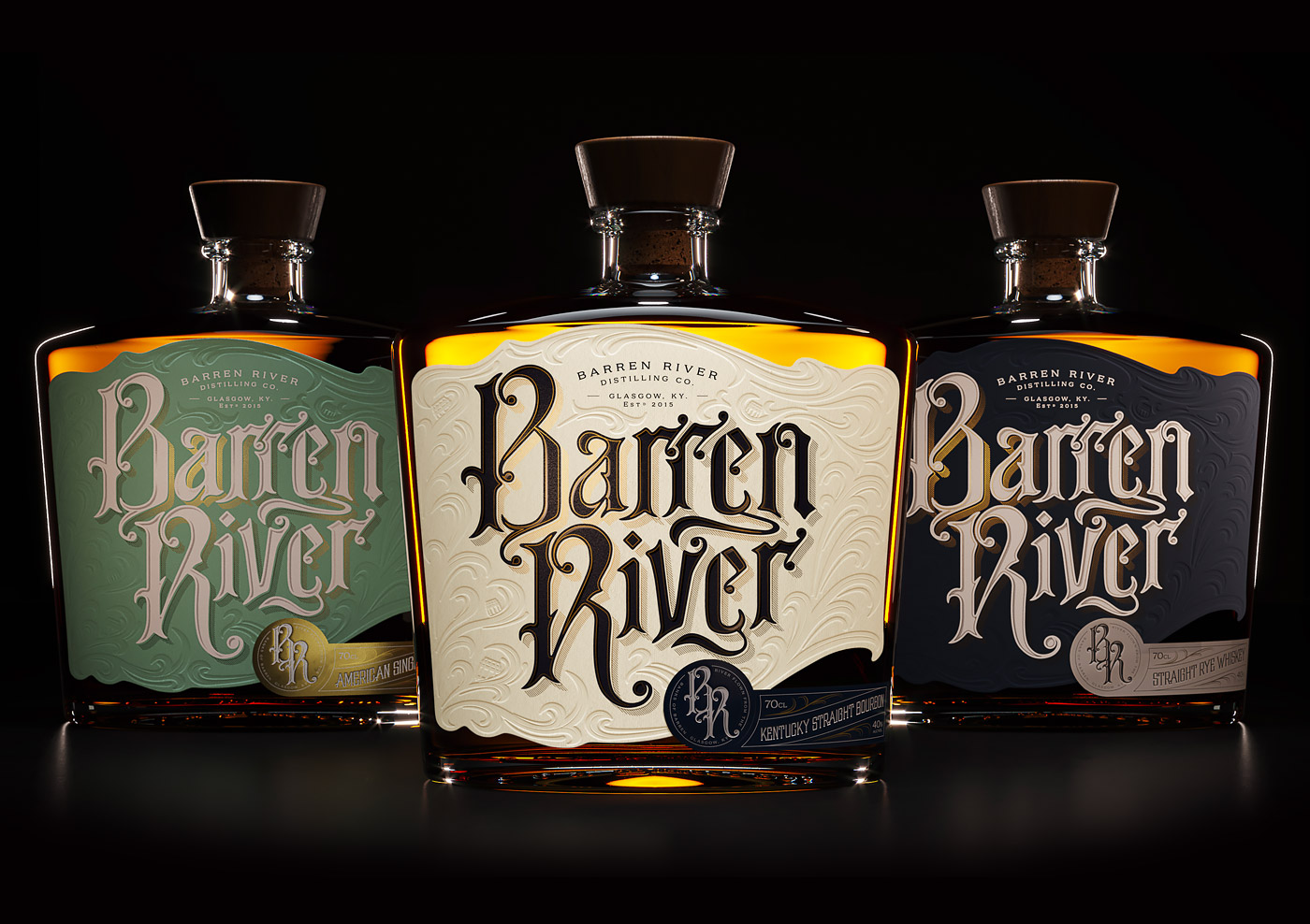
Barren River Bourbon: Packaging Design by Thirst
Published Feb 28, 2019
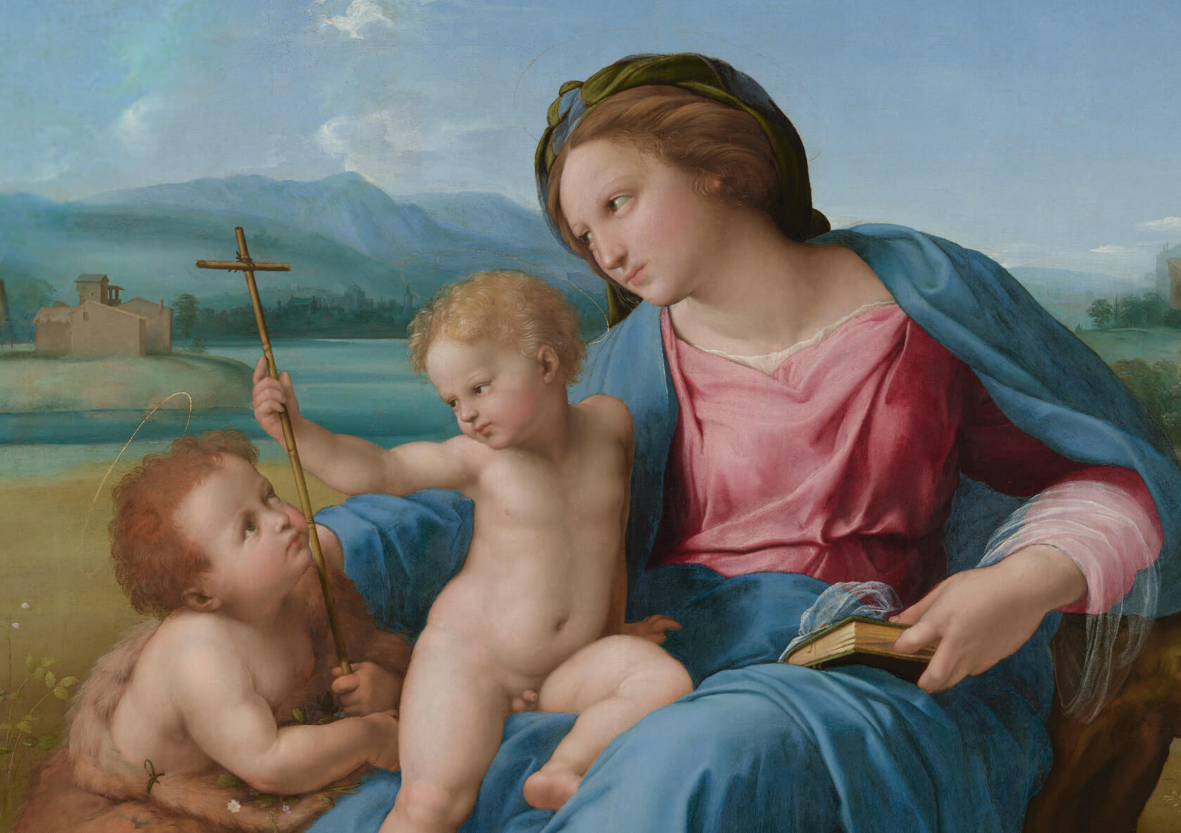
Here’s another exquisite piece of work by specialised British studio Thirst (previously here and here).
“A Tale of Texture, Detail and Depth
We brought this tale to life with old-American inspired hand drawn lettering and a heavily textured design. De-bossed waves and a bespoke die cut represent the river’s flow, while a monogram and secondary label adds a final touch of detail and depth to the design. Proof you should never judge a river by its name, but you should always judge a Bourbon by its bottle.”

More articles

#want


These are affiliate links to Amazon and other partner brands. We may earn a small commission if you click the link and make a purchase.
There is no extra cost to you, so it’s just a nice way to help support the site.


Related
inspiration
Awesome products for creatives
These are affiliate links to Amazon and other partner brands. We may earn a small commission if you click the link and make a purchase.
There is no extra cost to you, so it’s just a nice way to help support the site.
Inspiration
in your inbox
Amazing art & design, never any spam.
We care about protecting your data. Please refer to our Privacy Policy for more.
- Advertising
- Architecture
- Art
- Branding
- Fashion & Beauty
- Gaming
- Graphic Design
- Illustration
- Industrial Design
- Interior Design
- Logo Design
- Packaging Design
- Photography
- Pop Culture
- Print Design
- Product Design
- Technology
- Typography
- UX & UI Design
- Vehicle Design
- Video & Motion
© 2026 Inspiration Grid, all rights reserved. Some of our posts may contain affiliate links to partner brands. We earn a small commission if you click the link and make a purchase. There is no extra cost to you, so it’s just a nice way to help support the site. All images, videos, and other content posted on the site is attributed to their creators and original sources. If you see something wrong here or you would like to have it removed, please contact us.