

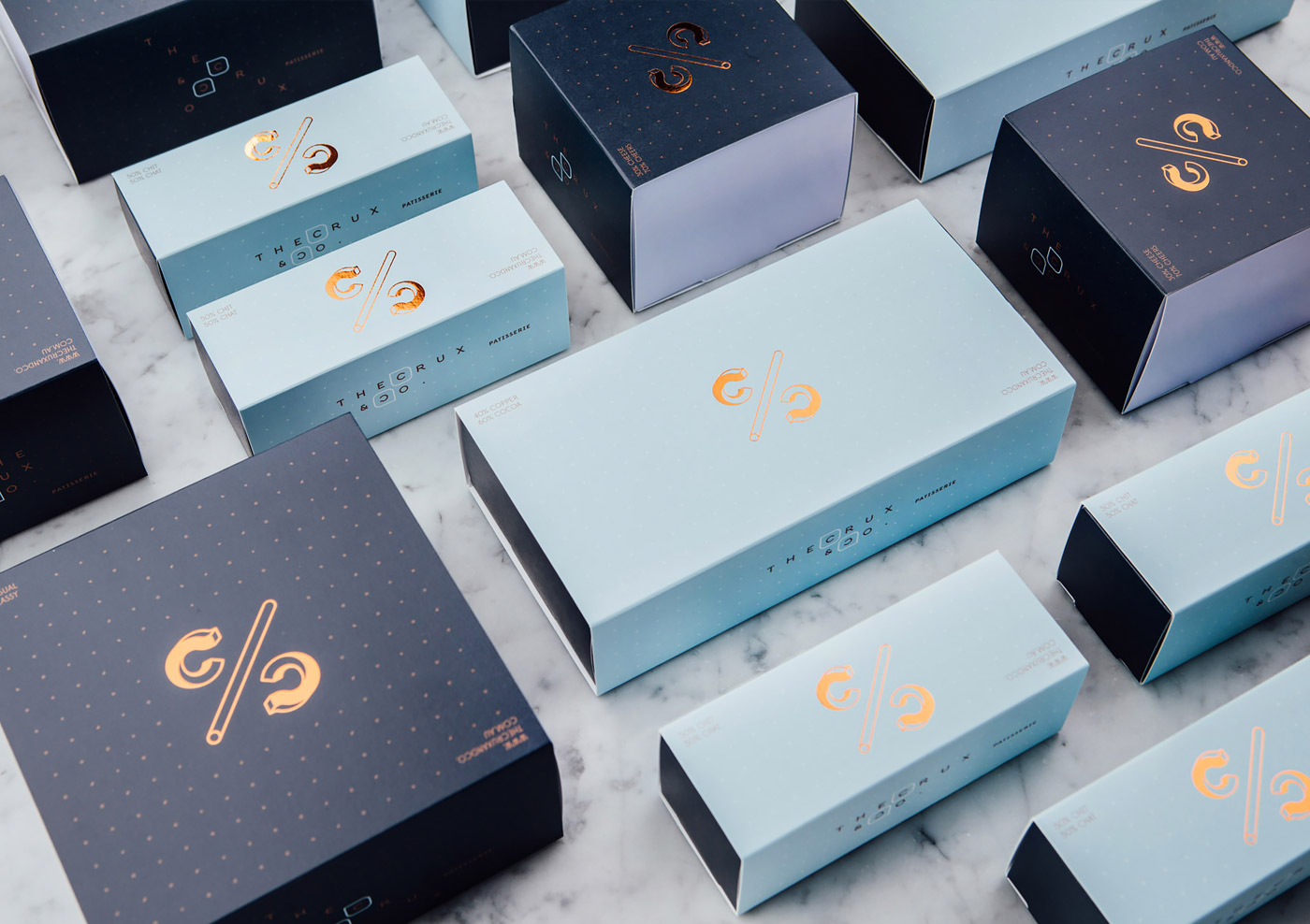
The Crux & Co. Branding & Packaging by Hue Studio
Published Apr 2, 2018
Excellent branding work by Australian firm Hue Studio for The Crux & Co, a café and patisserie in Melbourne.
“They say life is all about balance and that is the crux of the branding. From the monogram logo which resemblance the percentage symbol and a series of C/C tag lines are all balanced out by the pattern streamlined across all artwork and packaging. Custom designed typeface were developed for a family of logo type which featured on each packaging, not one having the other. Architecture and interior by Architects Eat.”


More articles


#want


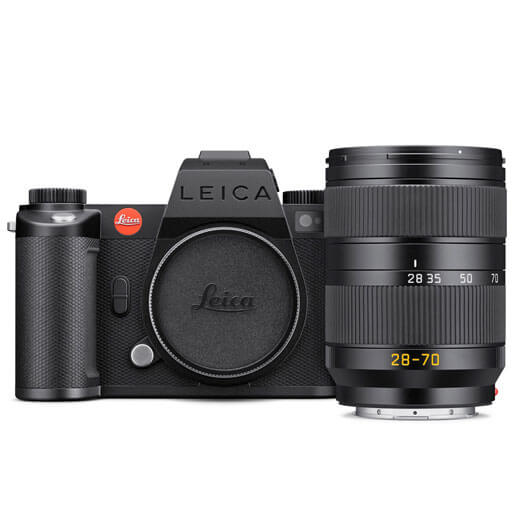
These are affiliate links to Amazon and other partner brands. We may earn a small commission if you click the link and make a purchase.
There is no extra cost to you, so it’s just a nice way to help support the site.


Related
inspiration
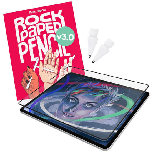
Awesome products for creatives
These are affiliate links to Amazon and other partner brands. We may earn a small commission if you click the link and make a purchase.
There is no extra cost to you, so it’s just a nice way to help support the site.
Inspiration
in your inbox
Amazing art & design, never any spam.
We care about protecting your data. Please refer to our Privacy Policy for more.

- Advertising
- Architecture
- Art
- Branding
- Fashion & Beauty
- Gaming
- Graphic Design
- Illustration
- Industrial Design
- Interior Design
- Logo Design
- Packaging Design
- Photography
- Pop Culture
- Print Design
- Product Design
- Technology
- Typography
- UX & UI Design
- Vehicle Design
- Video & Motion
© 2026 Inspiration Grid, all rights reserved. Some of our posts may contain affiliate links to partner brands. We earn a small commission if you click the link and make a purchase. There is no extra cost to you, so it’s just a nice way to help support the site. All images, videos, and other content posted on the site is attributed to their creators and original sources. If you see something wrong here or you would like to have it removed, please contact us.