

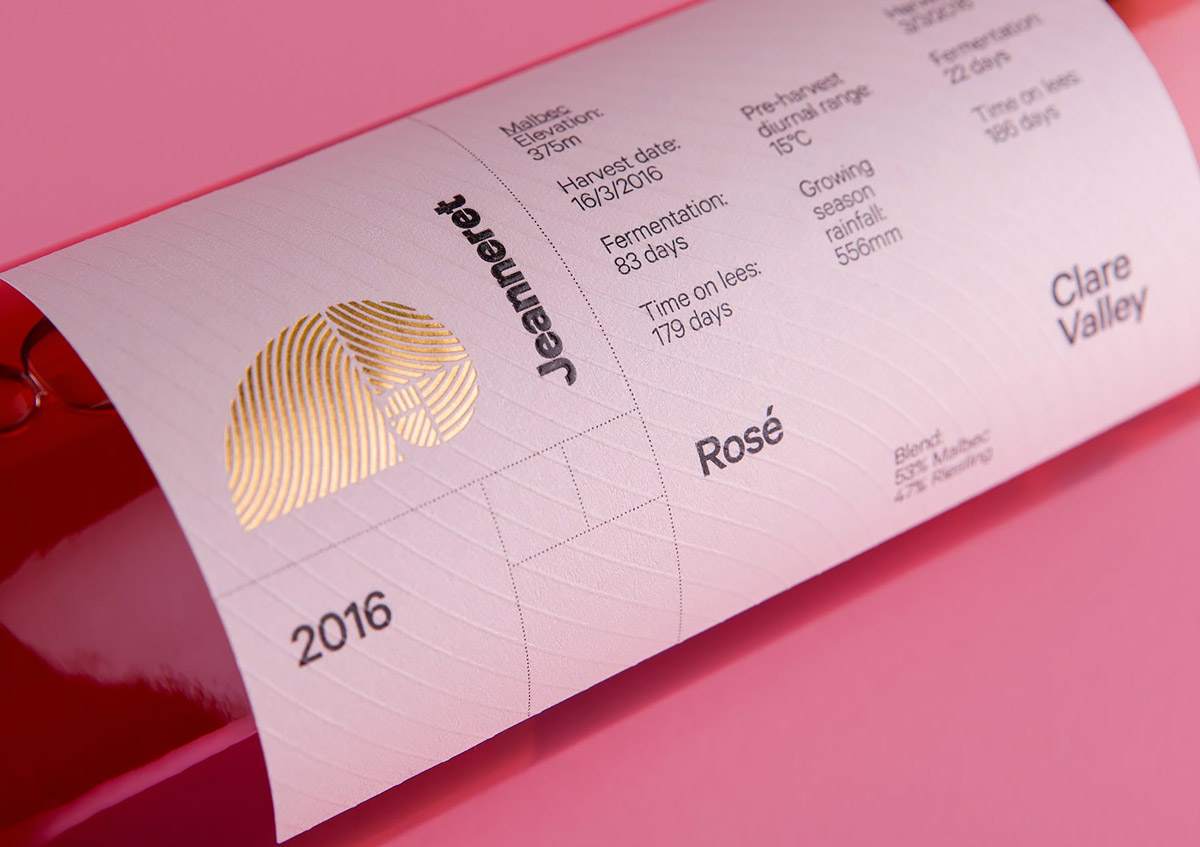
Jeanneret Wines: Branding & Packaging Design by Studio Band
Published Jul 10, 2017
Loving the elegant simplicity of the new identity and labels for Jeanneret Wines, created by Studio Band.
“The brand’s former logo, a nautilus shell representing the Golden Ratio, referenced family ties to Le Corbusier, the Swiss-French pioneer of modern architecture. Le Corbusier’s designs were based upon proportions found in the natural world – a practice that echoes the winemaking process and inspired our approach.”


More articles

#want


These are affiliate links to Amazon and other partner brands. We may earn a small commission if you click the link and make a purchase.
There is no extra cost to you, so it’s just a nice way to help support the site.


Related
inspiration
Awesome products for creatives
These are affiliate links to Amazon and other partner brands. We may earn a small commission if you click the link and make a purchase.
There is no extra cost to you, so it’s just a nice way to help support the site.
Inspiration
in your inbox
Amazing art & design, never any spam.
We care about protecting your data. Please refer to our Privacy Policy for more.

- Advertising
- Architecture
- Art
- Branding
- Fashion & Beauty
- Gaming
- Graphic Design
- Illustration
- Industrial Design
- Interior Design
- Logo Design
- Packaging Design
- Photography
- Pop Culture
- Print Design
- Product Design
- Technology
- Typography
- UX & UI Design
- Vehicle Design
- Video & Motion
© 2026 Inspiration Grid, all rights reserved. Some of our posts may contain affiliate links to partner brands. We earn a small commission if you click the link and make a purchase. There is no extra cost to you, so it’s just a nice way to help support the site. All images, videos, and other content posted on the site is attributed to their creators and original sources. If you see something wrong here or you would like to have it removed, please contact us.