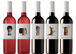
Wines Of The World by Lavernia & Cienfuegos
Published Nov 7, 2012
Spanish studio Lavernia & Cienfuegos created this series of wine labels depicting clever cork illustrations to represent the country of origin for each wine in the affordable “everyday” line of a Belgian supermarket chain.
“The cork is a sign of humility, an object of little value, often used as art supplies, as a simple and easily manipulated element with which to play and create. The use of cork gives it the air of something simple, characteristic of an everyday product. The cap is the element that unifies and personalizes the entire line.”
More articles
#want
These are affiliate links to Amazon and other partner brands. We may earn a small commission if you click the link and make a purchase.
There is no extra cost to you, so it’s just a nice way to help support the site.
Related
inspiration
Awesome products for creatives
These are affiliate links to Amazon and other partner brands. We may earn a small commission if you click the link and make a purchase.
There is no extra cost to you, so it’s just a nice way to help support the site.
Inspiration
in your inbox
Amazing art & design, never any spam.
We care about protecting your data. Please refer to our Privacy Policy for more.
- Advertising
- Architecture
- Art
- Branding
- Fashion & Beauty
- Gaming
- Graphic Design
- Illustration
- Industrial Design
- Interior Design
- Logo Design
- Packaging Design
- Photography
- Pop Culture
- Print Design
- Product Design
- Technology
- Typography
- UX & UI Design
- Vehicle Design
- Video & Motion
© 2026 Inspiration Grid, all rights reserved. Some of our posts may contain affiliate links to partner brands. We earn a small commission if you click the link and make a purchase. There is no extra cost to you, so it’s just a nice way to help support the site. All images, videos, and other content posted on the site is attributed to their creators and original sources. If you see something wrong here or you would like to have it removed, please contact us.
