

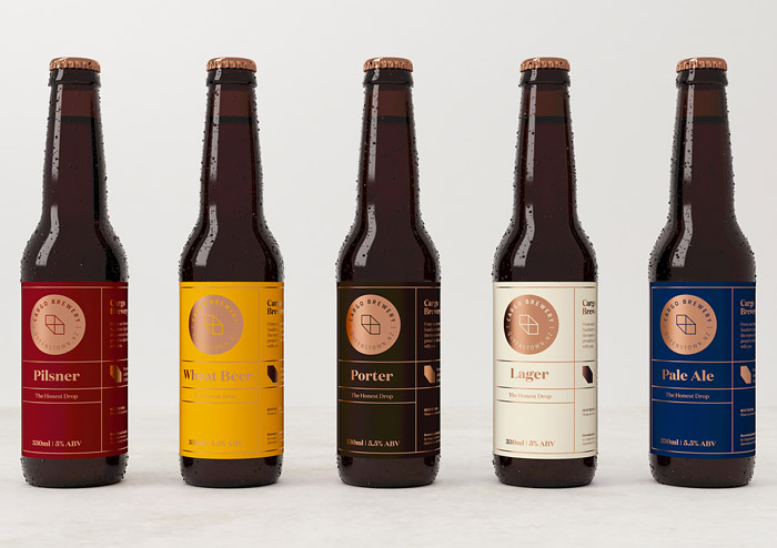
Cargo Brewery Identity & Packaging by Makebardo
Published May 4, 2016
Great branding project by New Zealand-based studio makebardo for Cargo Brewery.
“The Cargo Brewery visual identity was built on one main brand colour – copper foil. This choice was made as it expresses quality, bolstering the connotations of ‘market leader’, ‘premium’, ‘exclusive’ and ‘innovative brand’.
We decided to use copper instead of the more obvious luxury metals such as gold and silver as copper is less commonly used in brew brands, thereby creating a more distinctive and highly visible identity.”
— makebardo

More articles

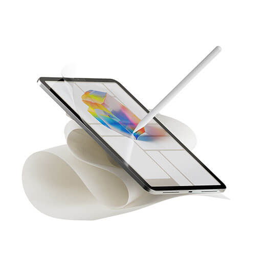
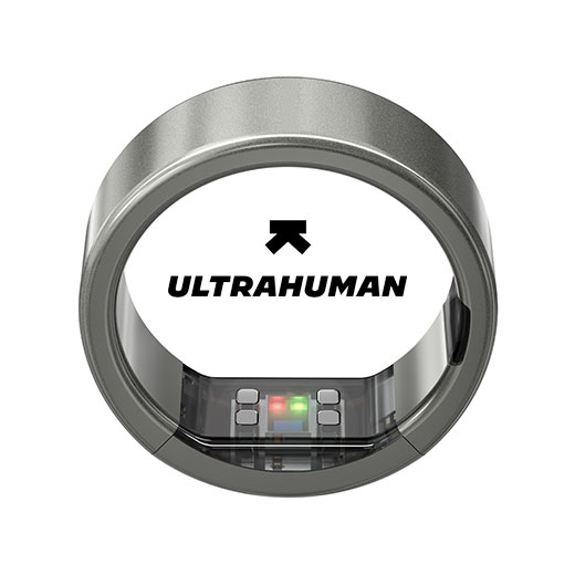
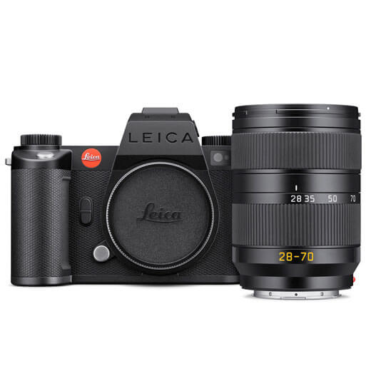
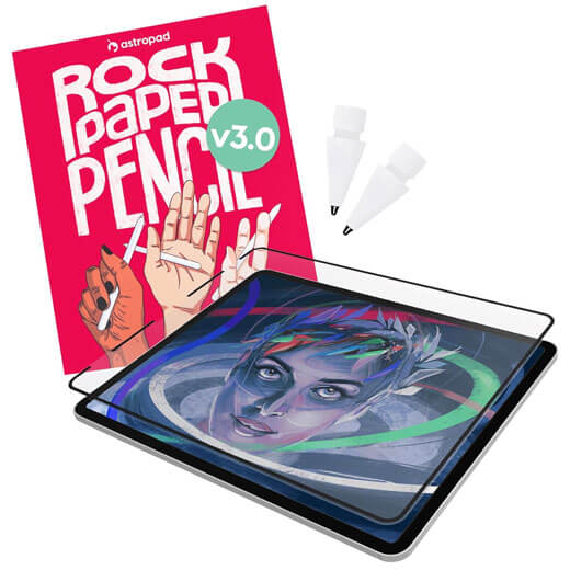
#want


These are affiliate links to Amazon and other partner brands. We may earn a small commission if you click the link and make a purchase.
There is no extra cost to you, so it’s just a nice way to help support the site.


Related
inspiration
Awesome products for creatives
These are affiliate links to Amazon and other partner brands. We may earn a small commission if you click the link and make a purchase.
There is no extra cost to you, so it’s just a nice way to help support the site.
Inspiration
in your inbox
Amazing art & design, never any spam.
We care about protecting your data. Please refer to our Privacy Policy for more.

- Advertising
- Architecture
- Art
- Branding
- Fashion & Beauty
- Gaming
- Graphic Design
- Illustration
- Industrial Design
- Interior Design
- Logo Design
- Packaging Design
- Photography
- Pop Culture
- Print Design
- Product Design
- Technology
- Typography
- UX & UI Design
- Vehicle Design
- Video & Motion
© 2026 Inspiration Grid, all rights reserved. Some of our posts may contain affiliate links to partner brands. We earn a small commission if you click the link and make a purchase. There is no extra cost to you, so it’s just a nice way to help support the site. All images, videos, and other content posted on the site is attributed to their creators and original sources. If you see something wrong here or you would like to have it removed, please contact us.